Table of Contents (Click to show/hide)


Why improving creative assets is essential?
Does it increase the CTR? Brand awareness? Readability?
How to improve the ad quality score to lower the CPC?
Creative assets are an important tool that helps increase the online presence, reach out to the target audience, and influence prospects' desires. With the advanced usage of this marketing tool, advertisers can efficiently deliver key business messages to their target audience anywhere on any platform. As a result, good creative assets are highly likely to attract more clicks and interactions, which is very helpful in getting the target CPA.
How to Maximise Creative Assets Quality and Standards?
Creating extraordinary creative assets requires a profound understanding of user design and experience. There is a wide variety of creative assets to boost the marketing efforts, and it is vital to optimise and constantly analyse the balance among all these creative assets. There are usually four significant parameters to identify good creative assets:
- Readability
- Clarity
- Engagement
- Delivery
In this article, I will provide some practical, evidence-based tips to improve these four parameters for text, image, and video assets. From case type to image design, the best practices here are to optimise the Click-Through Rate(CTR) to align with your business goals.
TL;DR version

Best Practices For Optimising Google Text Ads
The race to remain on the top of the search results is accurate, and you must be familiar with the practical tips for optimising Google Text Ads to have your Ad Ranks stay on the top of Ad Rank Thresholds.
Provide a Relevant, Specific Call To Action
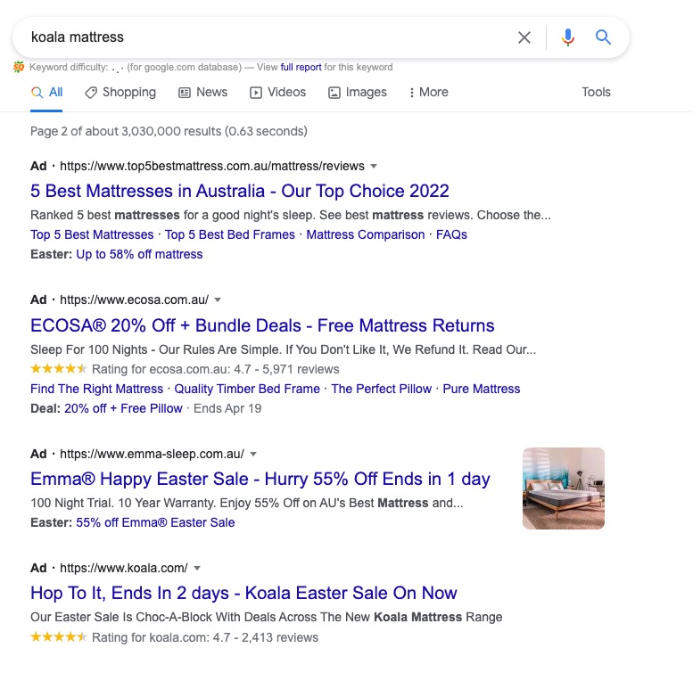
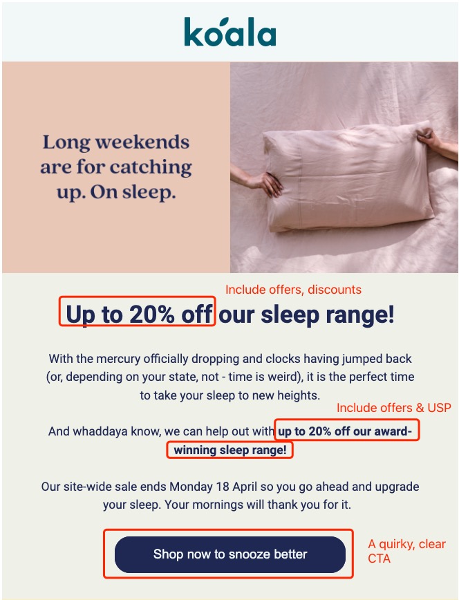
First, it is essential to have call-to-actions to instruct the audience on the next step. What's more, the punchline tells your audience what you have to offer. But the way to include your CTA has evolved differently from the standard CTAs. There are no more traditional CTA such as Learn More, Shop Now that are used, but the market specified, offer-focused, product-oriented and attractive CTAs are the new standard now.
Such as, if you are selling a dining chair, the CTA, "shop the dining chair on 25% off Now," would attract more audience than just <Shop Now>.
Engaging The Audience With "YOU"
Never underestimate an approachable ad. Engaging the clients in the ad text will help you to increase engagement and connect with more audiences. The usage of [YOU] in the ad text provides a connecting approach to the audience, and personalised ads perform way better than those ordinary ads. According to Think with Google (2022), there's a 1.3x-2x increase in conversion performance to include personalised ads than without.
For example:
- For furniture ad: Remains strong and supportive for years to come, no matter how many times you move it.
- For furniture ad: Soft and smooth to the touch, and a dream to snooze in. Up your sleep game.
- For SaaS ad: Find your perfect pair with virtual try-on
- For SaaS ad: The most advanced way to customise your link in bio
Read more on my Best Text Ads Templates.
State Clear Benefits Of Your Products & Services
Including your seed keywords and offers in your headline and descriptions with clear benefits in the texts will help customers understand the next step relevant to the audience's interests, search, or the landing page they will view.

Google recommends that adding the sale offer to the text ads increases the chance of connecting with the audience significantly. You can include sales offers, new product arrivals, shipping details, promo codes, discounted offers, and services that will assist you in expanding the reach of text ads. The headlines that provide offers to the audience are likely to attract 38% more audience. the best practice to have the best headline and descriptions are:
Feature Your Brand Name Every Time, Everywhere
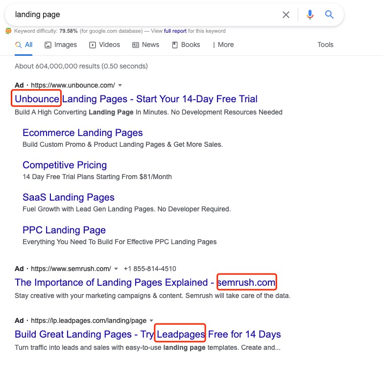
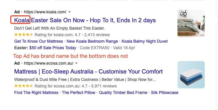
Use brand name frequently and feature your brand name in the primary position. Think about it. If you include your benefits & USPs in these titles & descriptions, your Responsive Search Ads might show your audience a version with no brand name. Your audience won't remember anything about your brand hence losing the opportunity for impression-based conversions - your prospects won't remember your brand name and perform a search after seeing your ads.
Experiment Title Case In Your Description
Just like the images shown above, you can see most of the advertisers are using Title Case in their descriptions. Description in the Title Case has better performance (source: 1). According to Google, Title Case descriptions perform up to 27% better in conversion than case descriptions. However, I highly recommend you run an experiment first because the results show otherwise on my end.
Here is my story. My direct report comes from an agency background, and one day he proposed using Title Case in the description to improve the readability. I was feeling sceptical about that idea but happy to run an experiment. Interestingly, I read the article from Google Performance Assets Best Practices mentioned above, so I immediately scheduled two experiments to test this theory:
- a) Test 2 countries: Canada & United Kingdom, for a more holistic view of cultural impacts
- b) Test 2 funnels: Generic & Brand campaigns.
Here are my results:

Two are Better Than One
Prepare more than one variation and choose the best out of them. When ETA is still available, it"s recommended to have 3 ETAs and 1 RSA in each ad group. As we know, the ETA will be sunset in June 2022. With that in mind, preparing 2 RSAs in one ad group, 1 RSA with static texts and 1 RSA with Ad Customiser are recommended after the sunset of ETA.
Practical Tips on Google Display Ads Images
The role of images is very significant in the audience's decision-making, whether the product or services would be suitable for them or not. A good image always creates a good brand impact. The image is the first thing to have the clients' attention, so these are the ways to make them attractive.
- Use multiple images of the single product from different angles if possible so that the audience can have a holistic idea to reflect an actual product structure. Make sure that the only beautiful thing in the image is the product, and the image surrounded by multiple unnecessary objects can divert the audience's attention.
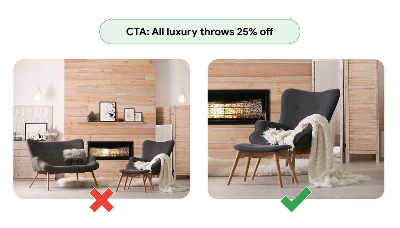
- Avoid using blurry or pixelated images and use only the focused images with at least 1200x pixels wide.
- When using the logos, use them aside to be visible but not block the image view. Also, make your images as natural as possible and avoid too many filters and effects.

- Use gradients or rainbows to create certain inclusive vibes. For example, be inclusive the deliver positive value - smiling people, LGBT+, rainbow colour or women, demonstrate your product's inclusive values. According to Google, images that use the people perform 30 % better than images without one as audiences are more likely to engage when they see themselves represented.
Optimise Google Video Ads
Video-based marketing and advertising are starting to dominate the mobile-first world of digitalisation. But, again, creativity is the key because the audience gets bored quickly watching the same ads repeatedly.
In this article, we talk primarily about YouTube ads.
- The key player in the Google video ads is the colour combination.
- Use tight framing and bright, natural lighting on specific people or objects. And apply brightness and contrast to make sure that your ad is easily visible on a small screen.
- Use text overlays if necessary without taking more than 20 % of the space. Images and videos with little to no text perform 20 % better. The ideal text length is about 20 characters.
- It is better to use the text (AKA Contextual Lyrics) in the videos so that the audience can easily understand the ad's message when the video is muted.
- The text in the video should be ideally placed and aligned about each frame. In addition, the videos should be short (15s) because no one wants to watch the long ads.
- Reiterate your CTA using text, animation, or voiceover throughout your ad.
- It is better to use the customised Call-To-Action and the video, and the brand name should be featured in the first 5 seconds of the video.
- Finally, Make sure to have the perfect combination of brightness and contrast.

Recap and My Final Thoughts
If we think carefully of the parameters we can optimise from text, image and video, we can easily find the pattern and make a checklist:
- Spoon-feeding your audience for a seamless ad experience. That means a specific CTA, featured brand name, technical unique selling point explanation, and an approachable tone in your text.
- Have a highlighting & focusing mindset—images with transparent logos and no attention diverting component.
- Concise and balanced videos with unique content and clear CTA are important tips for optimising Google Video Ads.
Bonus: creative callout extensions Templates (Source: Reddit)
Sources: Google/Ipsos, U.S., Inclusive Marketing Study, n of 2,987 U.S. consumers ages 13–54 who access the internet at least monthly, Aug. 2019.
Related Articles
Best Practices for Google Text Ad Copies (With Creative Copy Templates)
The Psychology of Colors: How marketers influence your decision
How To Write Killer SEO Titles For Blog


